

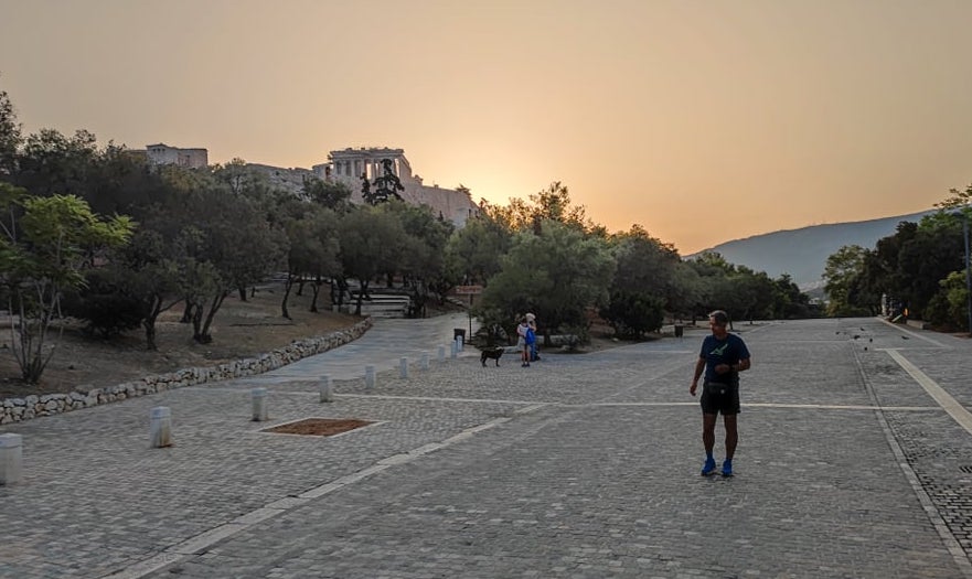
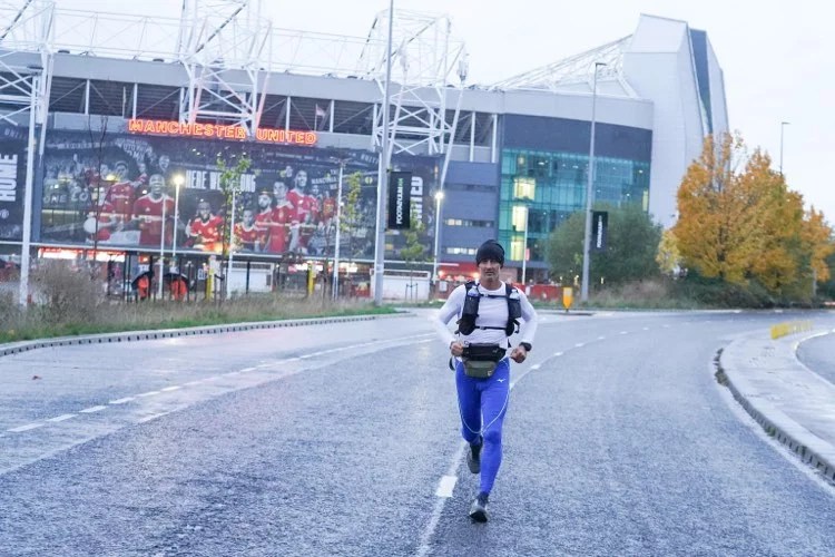
Now that Agis has finally reached his destination at the COP26 Conference in Glasgow, we can get a full look at the Air Quality he found all along his incredible 2421KM Climate Run.
Air Pollution is nowadays recognized as one of the most serious threats to people’s and the environment’s health. Nine people in ten breathe polluted air today. Eight million die each year because of it worldwide. 400.000 in Europe alone, and, of these, 16.600 in Greece. As sad as it is, not even COVID-19 has killed so many Greek citizens in just one year. As a matter of fact, people and the authorities fear so much COVID-19 while ignoring the real elephant in the room. An elephant that makes COVID-19 even more lethal because it damages the same organs that are attacked by the coronavirus, which actually finds it easier to infect and damage those organs even further. In fact, a recent study found that long-term exposure to Air Pollution increases COVID-19 deaths by 15 percent worldwide. In locations with higher Air Pollution levels the percentage increases: in East Asia, with its very high pollution, that number is 27%, in Europe it is 17%, etc. In Greece it must be over 20%, but nobody tells us that… One in five Greeks who die from COVID-19 dies because he/she has been chronically exposed to high Air Pollution in his/her life, but no one takes this knowledge seriously and dares to admit that Air Pollution is actually a BIG problem, which must be dealt with ASAP. Imagine how much money would be saved if we cleaned up the air we breathe… And how many lives would be spared!
Before the start of his 2421km Climate Run, Agis agreed to take along with him one of my portable Air Quality meters, the small Plume Flow, because he was very intrigued at the idea of measuring the Air Quality on his journey, step by step, day after day. And he has been very diligent with it, sending back the data each day after the end of the run, so that I could put them all together in time for the end of his journey. The pollutants that we measured along the way are Particulate Matter PM2,5 and Nitrogen Dioxide NO2. See here and here info about them and why they both are dangerous to our health.

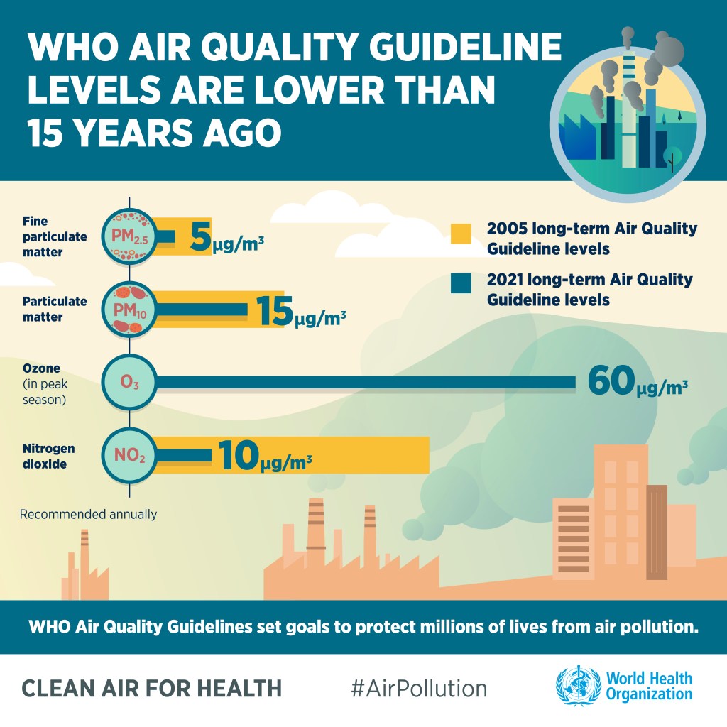
The results are interpreted following the new WHO guidelines for Air Quality, which have been revised just a month ago after a period of 16 years. Not surprisingly, the AQ recommended levels have been made stricter, because during these past 16 years thousands of scientific papers have been published, all saying the same thing: Air Pollution is much worse for us than we thought, and every organ of our body can be affected by it: lungs, heart, brain, nervous system, etc. In fact we all die 2 years earlier in average because of it.

Results
From Athens to Glasgow, Agis ran a total of 2064 km in 260 hours. He spent 49 days running on stretches that varied from 12 km to 69 km (39 km per day in average) at an average speed of 7,9 km/h.
Due to injuries to his leg muscles, Agis was forced to take more recovering days in Italy and France than he planned. As a result, he had to cut some parts of the 2421km run in order to reach Glasgow on time for the COP26 Conference, so in the end he run “just” 2064 km. Some days he had to walk for a great part of the stretch, while in other days he flew like the wind, especially during the very last day when he covered the 42 km to Glasgow in just 3 hours and 50 minutes – his fourth best performance on a full Marathon distance ever!
Along the way, Agis chose to run on various types of roads, from big state roads to smaller unpaved roads and even on footpaths in some French forests. On all these, it is obvious that the Air Quality he met was quite different: big, busy roads had much more pollution compared to unpaved roads with no traffic. Besides traffic pollution, Agis met also industrial pollution, and this was very obvious in Greece and N Italy. He also met some pollution from domestic winter heating around villages in France and in the UK.


Above are examples of the two types of maps that Agis obtained for the daily running tracks from his Garmin watch (left) and from the Plume Flow Air Quality meter (centre and right). The colors of the Flow maps describe the Air Quality met along the way and are the same as those described here below. The green track in the middle is from the track between La Tour du Pin and Lyon in France, where Agis ran with excellent Air Quality on September 20th. The more “colorful” map with lots of red and purple to the right is from the Vicenza-Verona stretch in N Italy, where Agis had to run breathing very polluted air on August 21st.

We present the results of this investigation in terms of the percentage of the total time that Agis ran breathing different concentrations of Air Pollution. These different concentrations are conveniently split in 5 categories.
The categories for Particulate Matter PM2,5 are the following:
- 0-5 μg/m3: Air Quality is satisfactory and there is no health threat. Breathing this kind of Air is optimal. This category is represented in the chart with the color green.
- 5-15 μg/m3: Air Quality is still satisfactory but not on the long term. It is ok to breathe this kind of Air but not for too long. We should always make sure that the mean AQ on an annual basis remains below 5 μg/m3. This category is represented in the chart with the color yellow.
- 15-35 μg/m3: AQ begins to enter dangerous levels. People with sensitivities to Air Pollution might start feeling uneasy. This category is represented in the chart with the color orange.
- 35-75 μg/m3: AQ is polluted. All people might begin showing symptoms on the long term. This category is represented in the chart with the color red.
- >75 μg/m3: AQ is very polluted. We all should avoid any kind of exposure to this levels of Air Pollution. This category is represented in the chart with the color purple.
And the categories for NO2 are:
- 0-25 μg/m3: Air Quality is satisfactory and there is no health threat. Breathing this kind of Air is optimal. This category is represented in the chart with the color green.
- 25-40 μg/m3: Air Quality is still satisfactory but not on the long term. It is ok to breathe this kind of Air but not for too long. We should always make sure that the mean AQ on an annual basis remains below 5 μg/m3. This category is represented in the chart with the color yellow.
- 40-60 μg/m3: AQ begins to enter dangerous levels. People with sensitivities to Air Pollution might start feeling uneasy. This category is represented in the chart with the color orange.
- 60-100 μg/m3: AQ is polluted. All people might begin showing symptoms on the long term. This category is represented in the chart with the color red.
- >100 μg/m3: AQ is very polluted. We all should avoid any kind of exposure to this levels of Air Pollution. This category is represented in the chart with the color purple.
Pie charts showing the percentage of time that Agis spent running in the various AQ categories for PM2,5


Pie charts showing the percentage of time that Agis spent running in the various AQ categories for NO2


Results Interpretation
Starting with PM2,5, the charts above show that:
- Agis met both clean and polluted air in all countries. In terms of absolutely best air quality (green category, 0-5 μg/m3), France was the best place to run for Agis. 33% of the air he found in France fell into this category. Running under these conditions is optimal and we all wish we could breathe that air. Worse country was Greece, with only 15% of very clean air.
- If we consider clean air also the one falling into the yellow category (5-15 μg/m3), then the UK are the winners (69%), followed by France (65%) and then by Italy and Greece (both 58%). We remind that the air in the yellow category is still considered ok but only on a short term, not on an annual basis (the annual mean should be lower than 5 μg/m3).
- Italy had the highest levels of Air Pollution (44% falling into the orange, red and purple categories), closely followed by Greece (42%), then by France (35%) and the UK (30%).
- In terms of very high pollution (red and purple categories), worst country was Greece (32%), closely followed by Italy (30%), while France had only 12% and the UK 8% of such a high Air Pollution. The high pollution difference between Italy/Greece and UK/France is quite big. France and the UK are clearly doing something about their Air Quality that Italy and Greece are not doing very well…
- By combining the PM2,5 results for all countries, we see that in average Agis ran with very good air (green category) for only the 28% of the time. If we include also the yellow category, this increases to 62%. Hence, it turns out that Agis had to run for more than a third of the time (38%) under polluted air conditions (orange, red and purple), which is not good. Especially worrying is the 20% of the time that was run with very polluted air (red and purple).
And about the NO2 results:
- At first glance, we see that NO2 pollution was less elevated than PM2,5, especially in France and in the UK. All countries had more percentage of clean air (green category) compared to PM2,5. Best country was France with 68%, followed by Greece (65%), then the UK (58%) and last Italy (55%). Including also the yellow category to clean air, France came still first with 98%, followed by the UK (91%), but then Greece falls quite back (73%) and Italy even further (61%).
- Both France and the UK had a minimal amount of NO2 pollution (2% and 9% respectively falling into the orange, red and purple categories) compared to Greece (28%) and Italy (39%).
- Again, quite worrying is the 21% of high NO2 pollution (red and purple) that Agis had to breathe in Greece, and especially the 32% he met in Italy.


What does all this mean?
In summary, the above data tell us that:
- Agis could enjoy perfectly healthy air only for less than a third of the almost three months it took him to reach Glasgow from Athens.
- For another third of the time he breathed air that is still considered satisfactory, but not on the long term.
- For more than a third of the Climate Run he had to run breathing polluted air.
- And most worrying for his health, Agis had to breathe very polluted (toxic) air for as much as a fifth of the total time he spent on the road.
If we consider the above results from an athlete point of view, we must think that a running person takes in much more air while running than while at rest, actually up to 10-20 times. Hence, the amount of pollutants that enter his/her body are much higher. This means that the 20% of very high Air Pollution that Agis had to breathe along his way to Glasgow has been doing him much much more harm than it would have done had he been traveling to Scotland sitting in a car or on a train. On the other hand, the very fact of doing such an intense physical exercise has counterbalanced part of the negative effects of air pollution, but surely not enough.
Agis started this long journey as a climate activist with the aim of raising awareness about the climate crisis. He took this message all along the way and discussed about it with so many people, surely amazing them with his incredible stories. And Air Pollution is just another face of the same coin called climate crisis, because it is created by the very same burning of fossil fuel and biomass that release tons of CO2, Particulate Matter and Organic Compounds in the air every single day.
By taking along a small Air Quality Meter, Agis has been able to bring a stronger, more tangible message to our leaders and decision makers that are gathered in Glasgow right now for the COP26 Conference. He did actually quantify, step by step, day after day, one of the factors that make the climate crisis a very serious threat to our well being, which is Air Pollution. With the data he gathered, he has in his hands a concrete proof which allows him to say that our addiction to burning fossil fuels and biomass for energy, transportation and heating do really threaten his health while he is doing his beloved sport – running. He really had to breathe 20% of very polluted air while running to Glasgow, and really only less than a third of the air he breathed was as clean as it should be (following the new WHO guidelines for Air Quality).
These are not just words, these are real facts that Agis experienced on his very skin. He and his endeavour are a strong voice for all of us. It is not acceptable that we all must be breathing these levels of Air Pollution anymore, because we are all in Agis’ position: nowadays nine out of ten of us are forced to breathe polluted air worldwide while simply doing what we like to do the most – living.
Our leaders and decision makers must finally listen to every other Agis that brings them concrete proof that the burning of fossil fuels and biomass is doing real harm to us and to the planet. At COP26 they should not be seeking for complicated solutions of net zero economies in order to further procrastinate the obvious solution anymore; they should simply dare to finally decide to completely stop burning fossil fuels and biomass so to leave the carbon in the ground. This would immediately stop the massive pumping of billions of kg of CO2 and other organic compounds into the atmosphere, which would stabilize the atmosphere and clean up the air. Agis and all other ultra-marathon runners, as well as all of us, would need not to worry about breathing Air Pollution anymore. What a beautiful world this would be…
